.png)
%20(1).png)
%20(2).png)
%20(1).png)
Gut Pop 🍹 | Gut-Friendly Soda Landing Page
Gut Pop is a soda brand made for people who love fizzy drinks but hate the bloat, fake sweeteners, and chemical additives in most sodas. The brand needed a landing page that could educate quickly, prove the health benefits, and still feel fun and approachable. The goal was to make the switch from regular soda to Gut Pop feel like the obvious choice.
The Problem:
Most sodas taste good but leave you feeling bloated, sluggish, and guilty about what’s inside them. Even “healthy” alternatives hide artificial sweeteners or ingredients that disrupt digestion. Gut Pop’s ideal customer isn’t just looking for a new flavor, they want something that tastes better and makes their gut feel better. The challenge was to make that benefit instantly clear while also showing why regular soda is part of the problem.
The Solution:
Every section of the page was designed to do one thing: make the visitor feel like Gut Pop is the soda upgrade compared to anything else they've tried before.
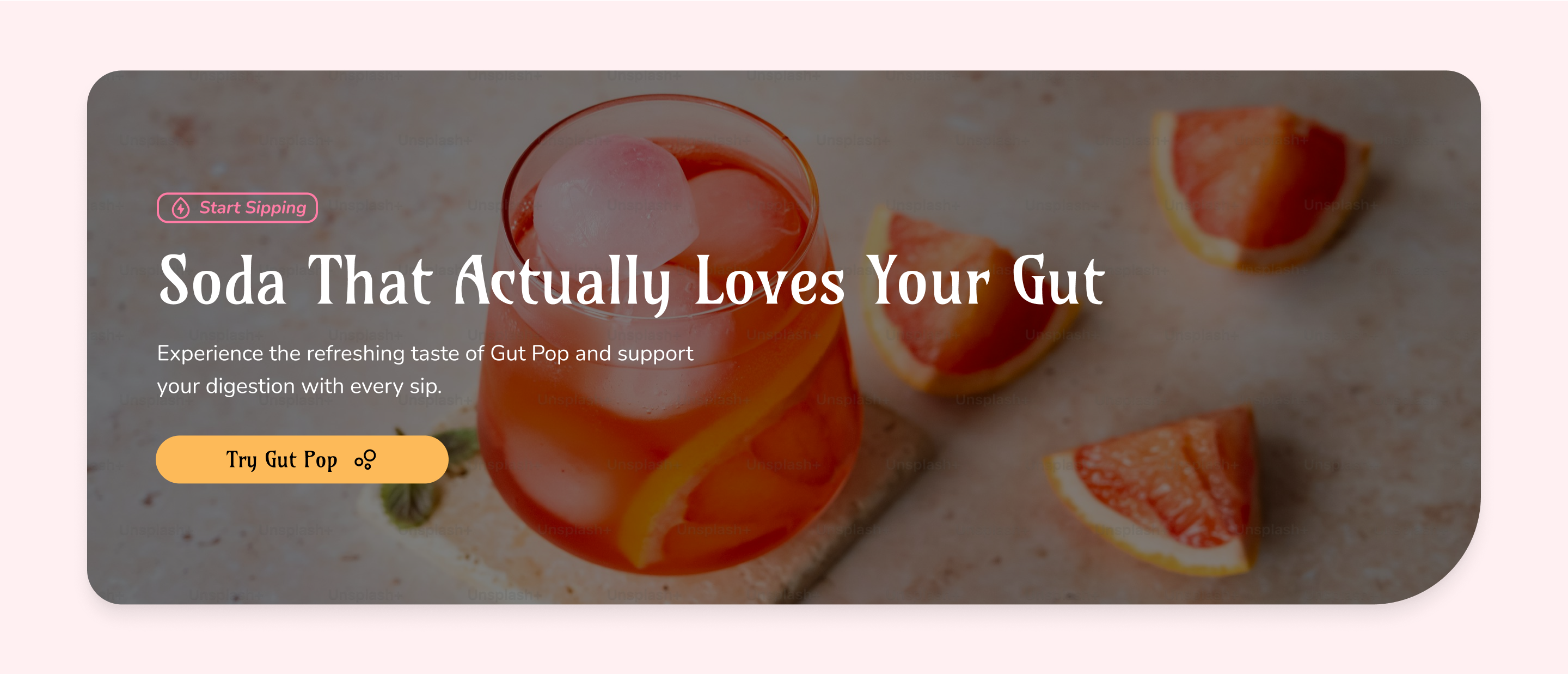
Section 1: Show the Product & Benefit Right Away
.png)
This section shows what makes Gut Pop special: bold flavors & gut-friendly benefits. The headline and images work together to make people feel excited, curious, and ready to learn more.
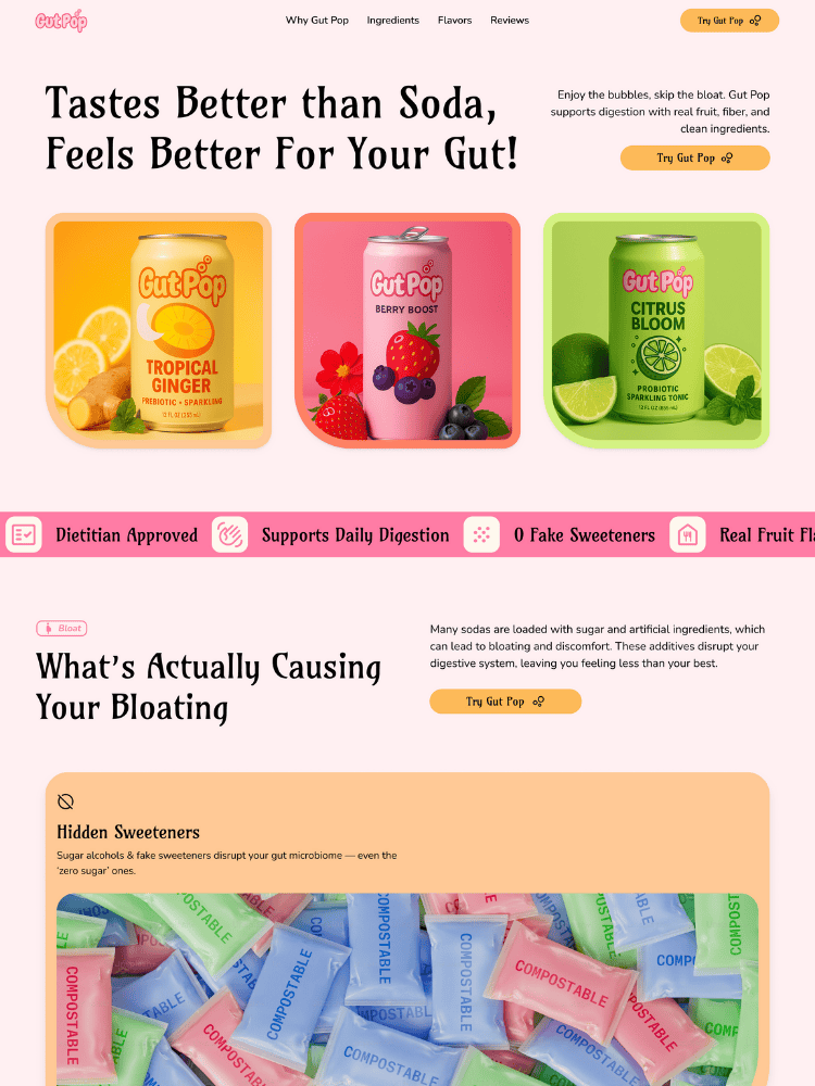
Section 2: Call Out What’s Messing With Their Gut
This section explains why most drinks leave people feeling bloated. It points to the real problems: fake sweeteners, weird chemicals, and too much fizz. This way they can relate and know that you understand their bloating problems
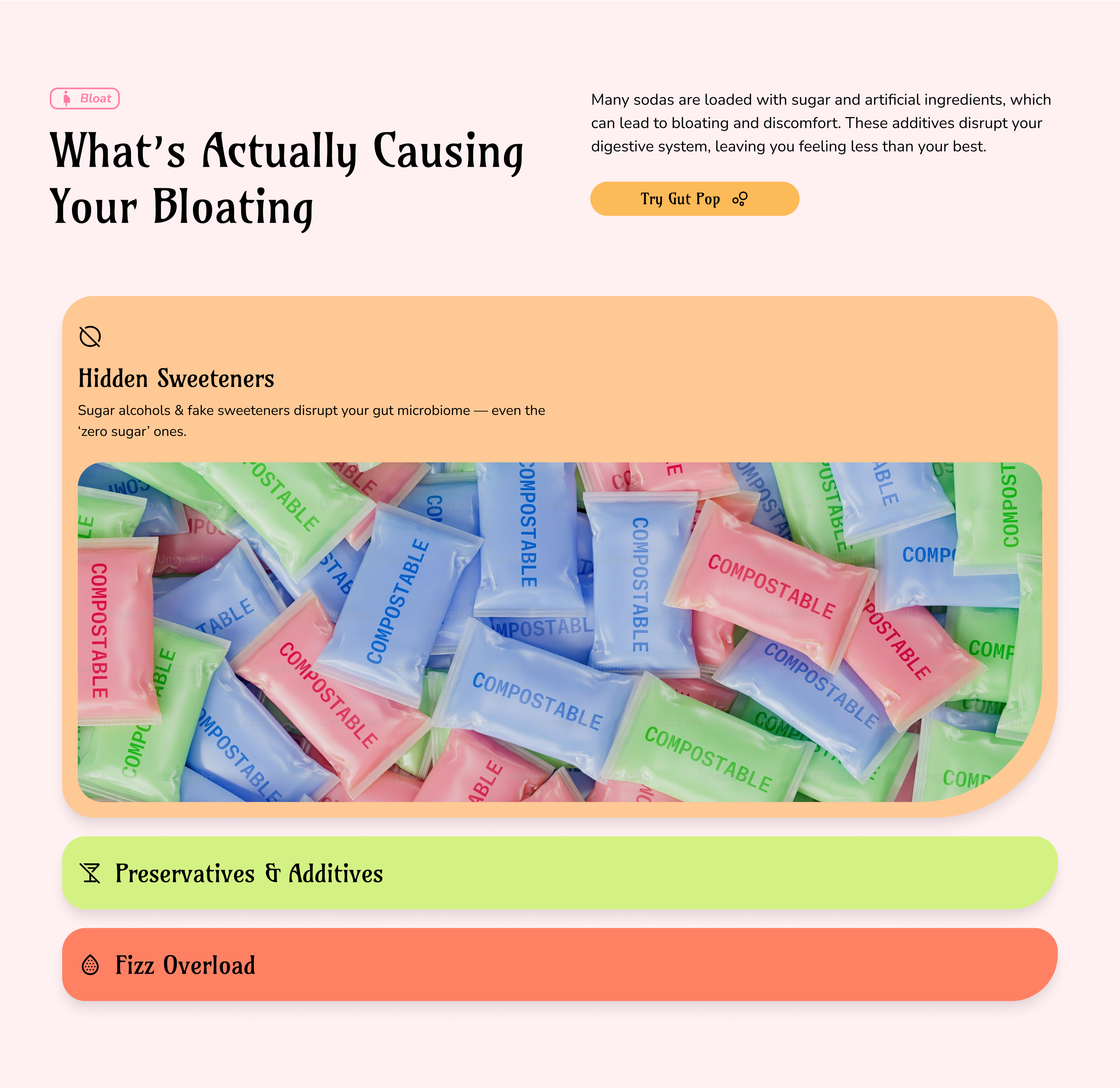
Section 3: Present the Solution to their Problems
Now that they know the problem, You show why your products ingredients work. It explains how prebiotics feed the good bacteria in your gut. That means less bloating, better digestion, and a body that feels more balanced.
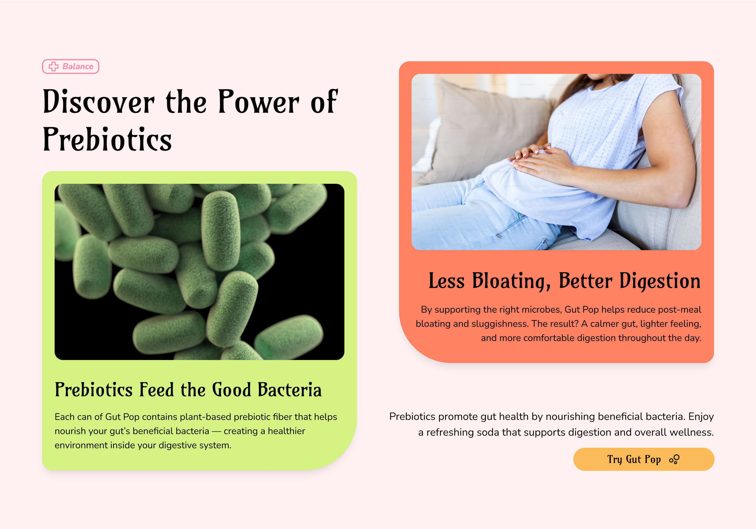
Section 4: Breakdown Benefits of Your Product
This part highlights the key benefits of Gut Pop. It shows how each ingredient helps your body: real fruit for sweetness, prebiotics for gut health, and light bubbles for comfort. It helps people quickly see why this drink is different.
Section 5: Showcase Your Product/Products
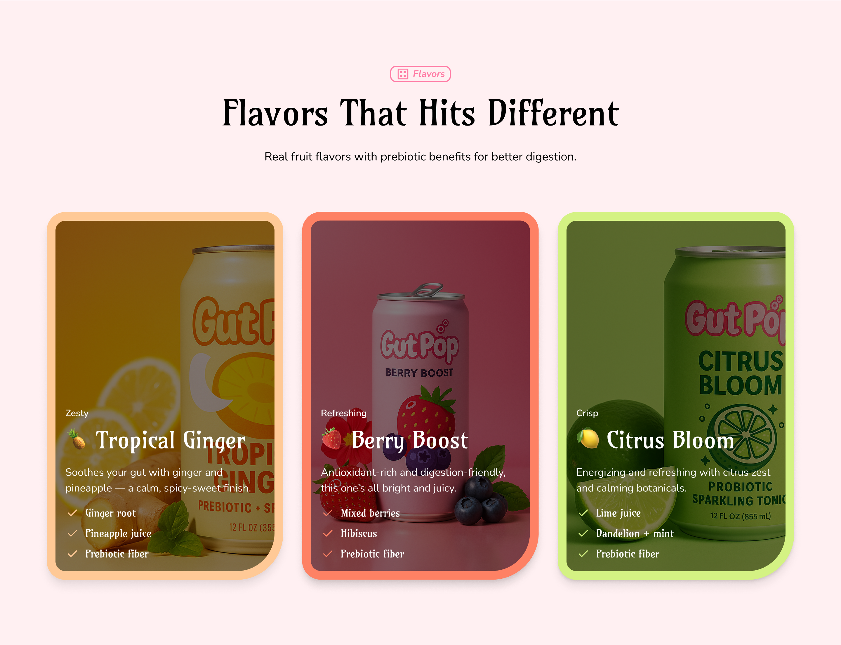
This section shows off the real ingredients in each flavor. From ginger and pineapple to berries and mint, every can has a clear purpose. It makes Gut Pop feel real, natural, and made to actually help you feel better.
Section 6: Provide Proof it Works for Other People
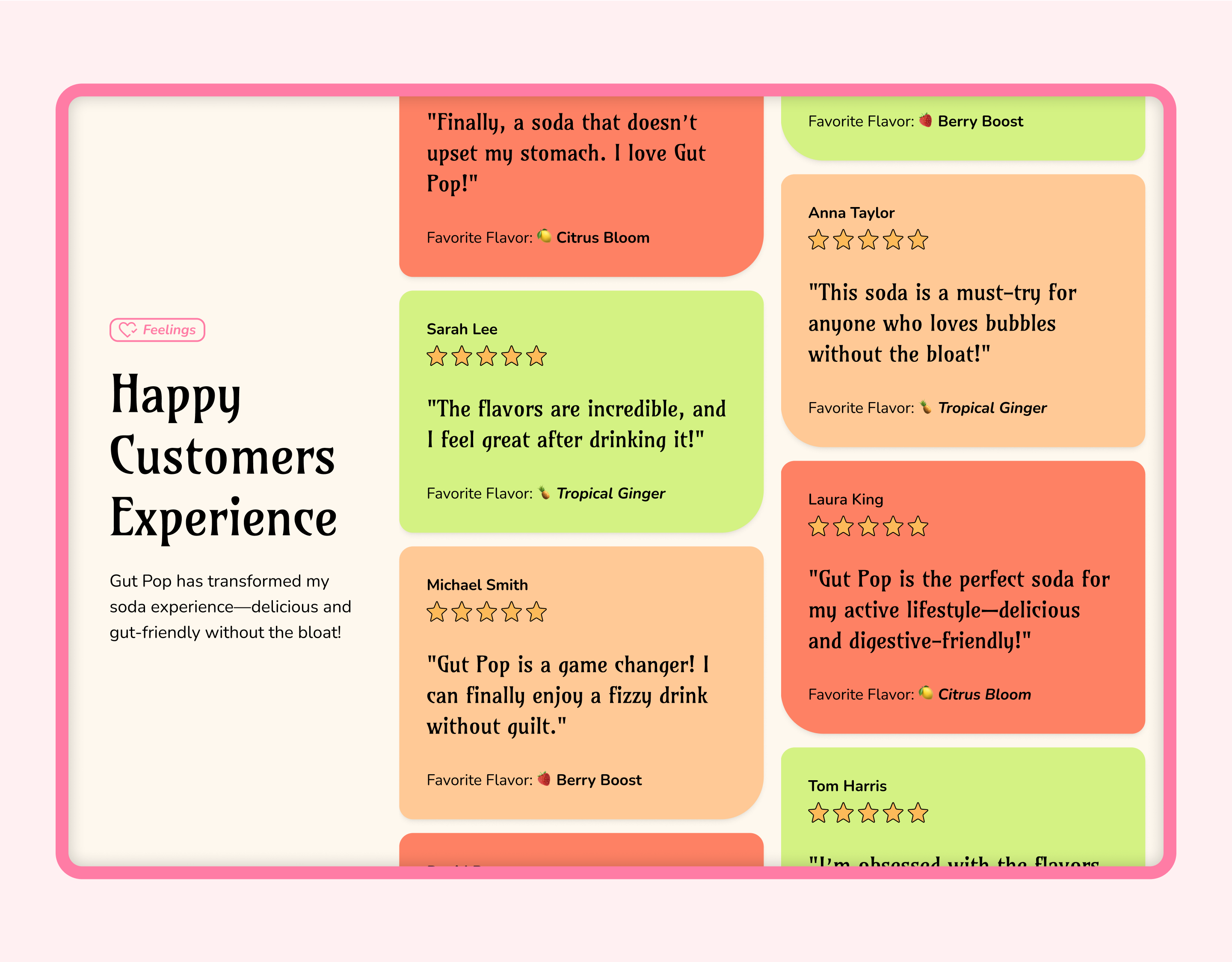
This section shares real reviews from people who love Gut Pop. It builds trust by showing how the drink helps with bloating, tastes great, and fits into their daily routine. The feedback makes everything feel honest and proven.
Section 7: Present the Offer
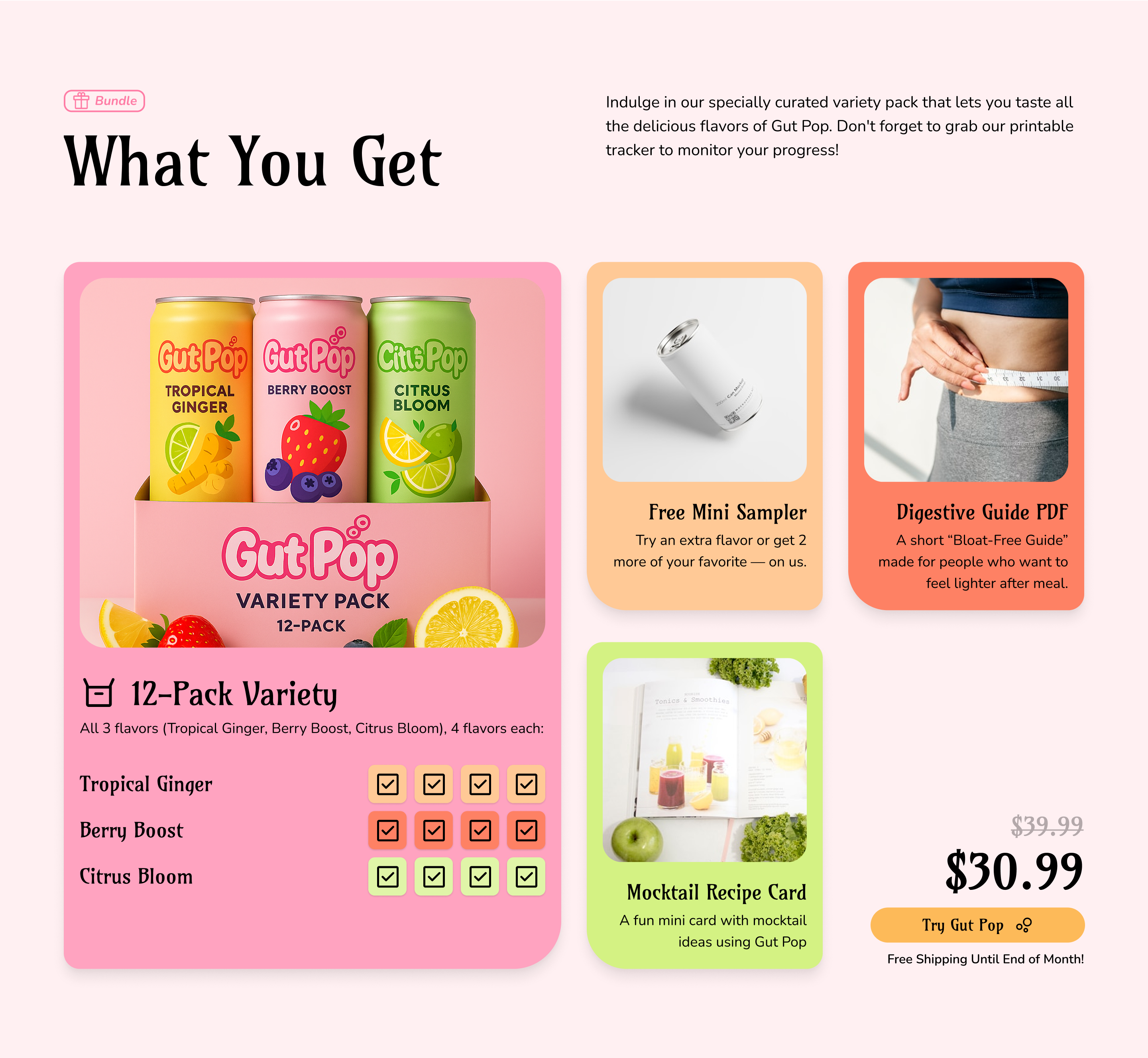
This section breaks down exactly what comes with the variety pack. It includes all 3 flavors, plus fun bonuses like a mini sampler, a bloat-free guide, and a mocktail recipe card. This makes the offer feel clear, valuable, and easy to say yes to.
Section 8: Answer All the Key Questions
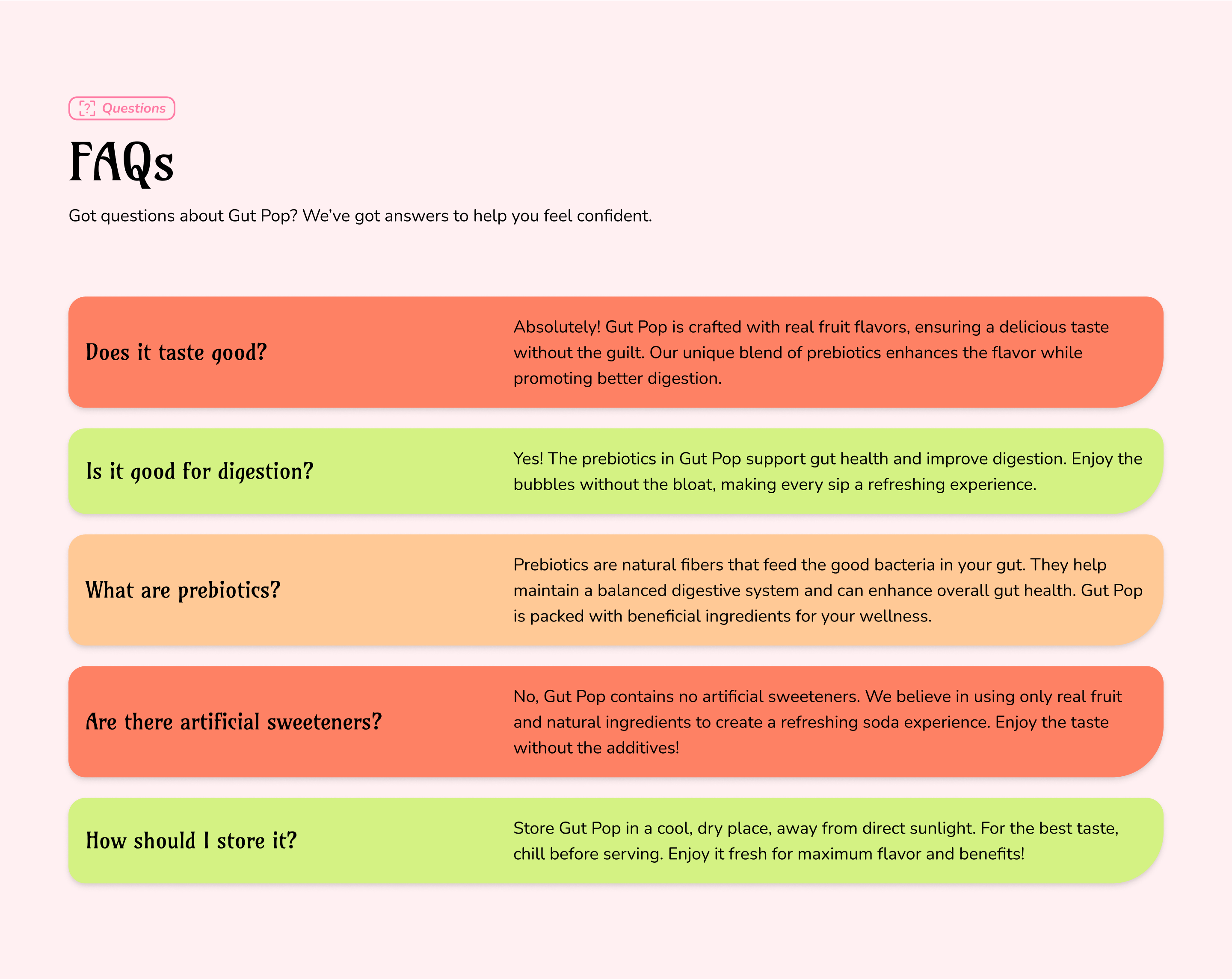
This FAQ section helps remove doubts. It explains taste, storage, sweeteners, and what prebiotics are. Each answer is simple and honest, helping people feel sure about trying Gut Pop.
Section 9: End with a Clear CTA
This section wraps everything up with one simple message: Gut Pop is refreshing and supports digestion. The background image, the button, and the line of text all work together to make the next step feel easy and worth it.
How It All Flows Together:
The page follows a step-by-step flow that makes the decision feel natural:
- Grab attention with a clear, gut-health-focused promise
- Call out the common soda problems they’ve experienced
- Show them why Gut Pop is different
- Explain how prebiotics help with digestion
- Highlight the flavors and benefits
- Stack the bundle with clear value
- Reinforce with real customer reviews
- Answer any questions or concerns about Gut Pop
- Make buying feel easy and low-risk
Expected Results:
This page is built to move people from curiosity to purchase in a single visit. Here’s what we’d expect:
- More first-time orders from cold traffic
- Because the page explains Gut Pop’s benefits and problems with regular soda in plain language
- Higher engagement on the flavor section
- Since each can has its own visual and benefit breakdown
- Better bundle uptake
- Because the offer section clearly lays out every item they get with their order
- Lower bounce rate
- Due to an easy flow that mixes bright visuals with short, direct copy
What Makes This Page Work:
This page doesn’t just show off the product. It connects to how the buyer feels after drinking regular soda and positions Gut Pop as the better choice.
It works because:
- It connects with the pain first.
- Calling out bloating and hidden ingredients gets immediate attention from the right audience.
- It’s easy to follow.
- Every section answers the next natural question in a buyer’s mind.
- It sells the switch, not just the soda.
- The page makes Gut Pop feel like an upgrade to a daily habit.
- It removes hesitation.
- Bonuses, clear value, social proof, and a guarantee make it simple to say yes.