.png)
.png)
HoneyTide 🍯 | Skincare Landing Page
HoneyTide is a clean, minimal skincare brand built around 3 real ingredients: grass-fed tallow, organic beeswax, and raw honey. The brand needed a landing page that didn’t just look pretty, but clearly showed why it’s different from the crowded skincare market filled with fillers, preservatives, and harsh chemicals.
The Problem:
Most skincare brands talk about “hydration” but hide a long list of fillers and preservatives that actually hurt the skin barrier. Moisturizer brand's ideal customers aren't just looking for moisture, they want something pure and safe enough for sensitive skin. The challenge was making that difference obvious right away & earning trust, while keeping it engaging.
The Solution:
Every section of this page is built to explain the benefit of HoneyTide, answer doubts, and guide the shopper toward buying.
The page is focused on making it clear this is real skincare made with only three ingredients, and show why that matters.
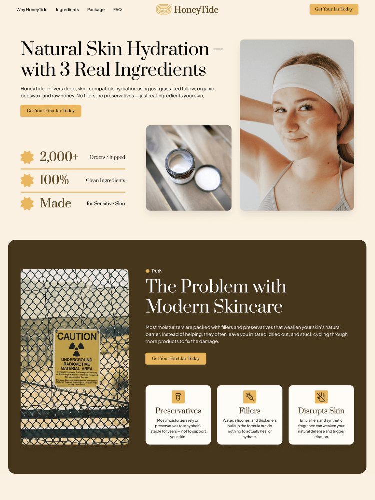
Section 1: Show What Makes You Different
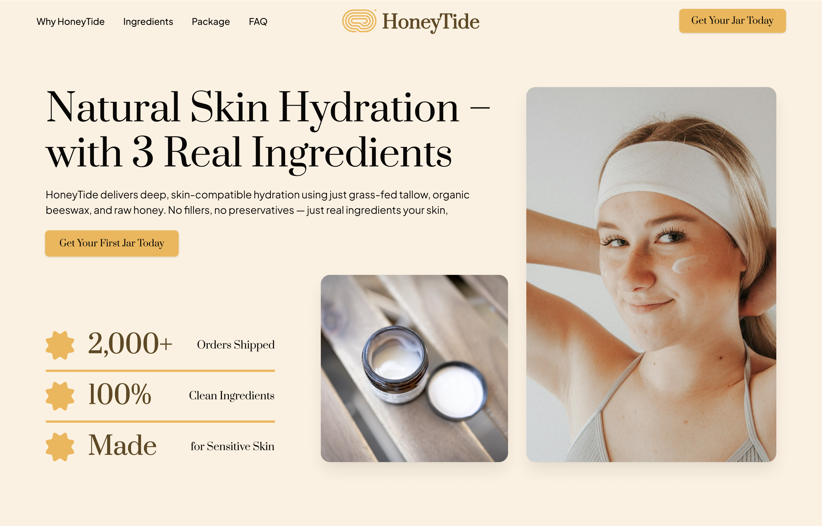
This section uses a strong headline, clean visuals, and trust signals to make a show this is skincare made with real, simple ingredients, nothing extra. That first impression helps people feel safe, curious, and ready to learn more.
Section 2: Explain You Understand the Customers
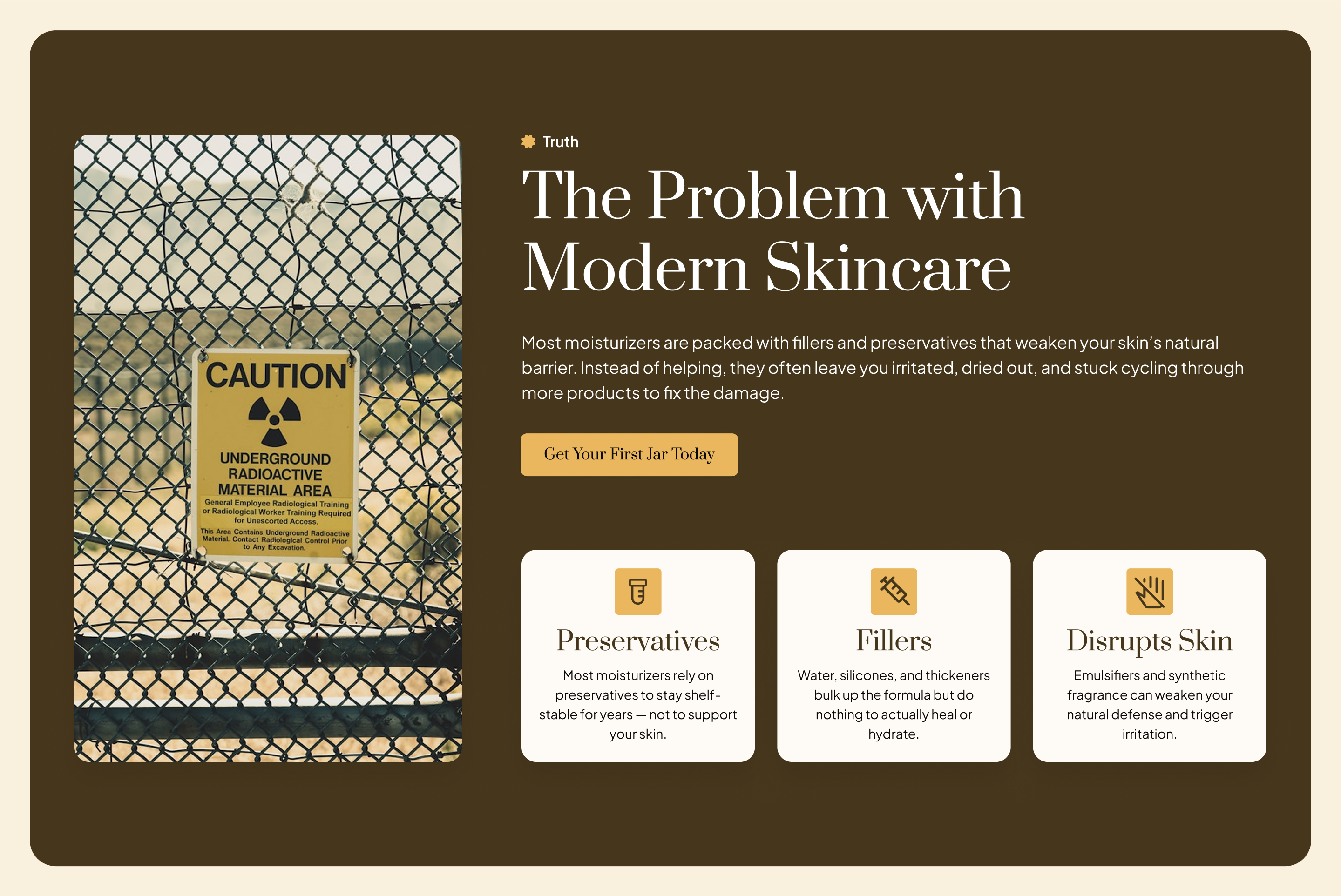
By showing the common issues (like preservatives and fillers), the brand proves it understands what customers are frustrated with — and sets the stage for why their product is different.
Section 3: Say What Makes You Different
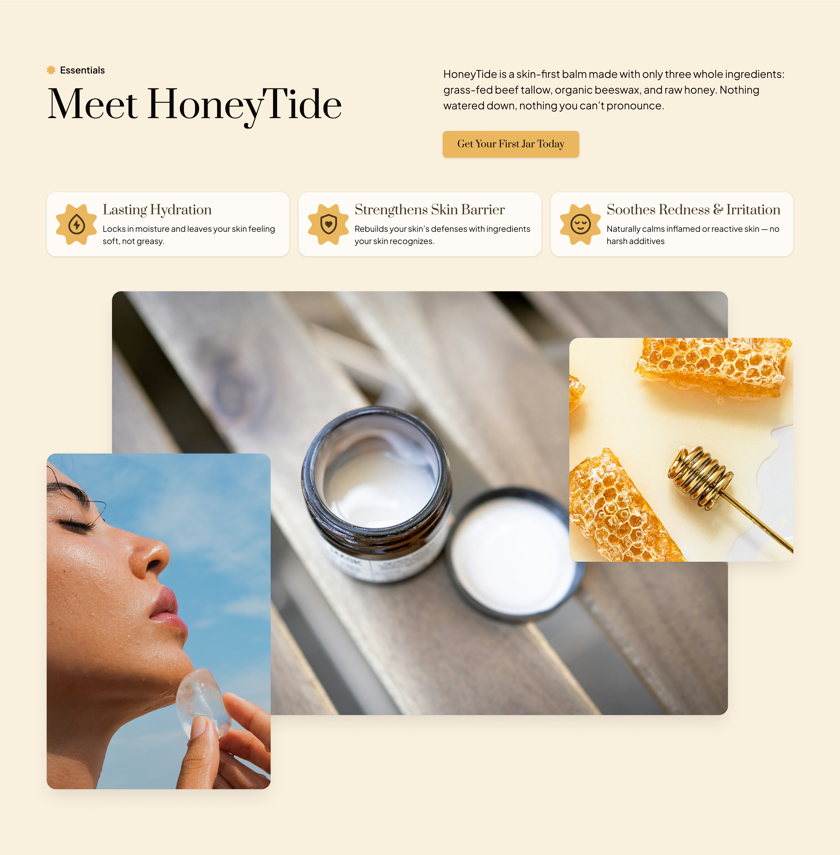
This section explains what the product is and how it works, in plain language. By highlighting the short ingredient list and what each one does, it builds trust and makes the brand feel transparent and safe to try.
Section 4: Build Trust with Transparency
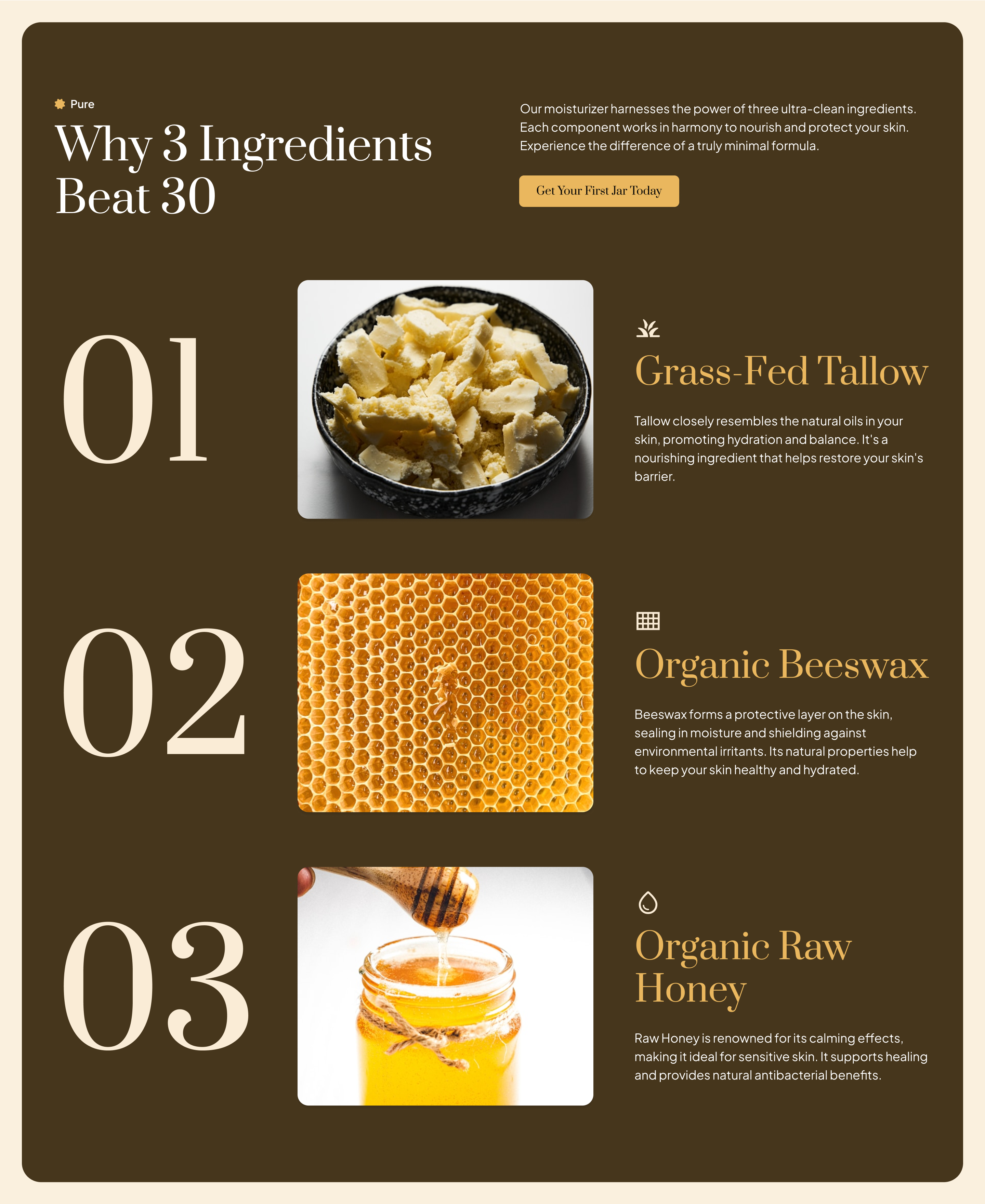
This section shows exactly what’s inside; no hidden chemicals, no long ingredient list. It gives each ingredient its own spotlight, so shoppers feel confident they know what they’re putting on their skin.
Section 5: Texture and Feel on Skin
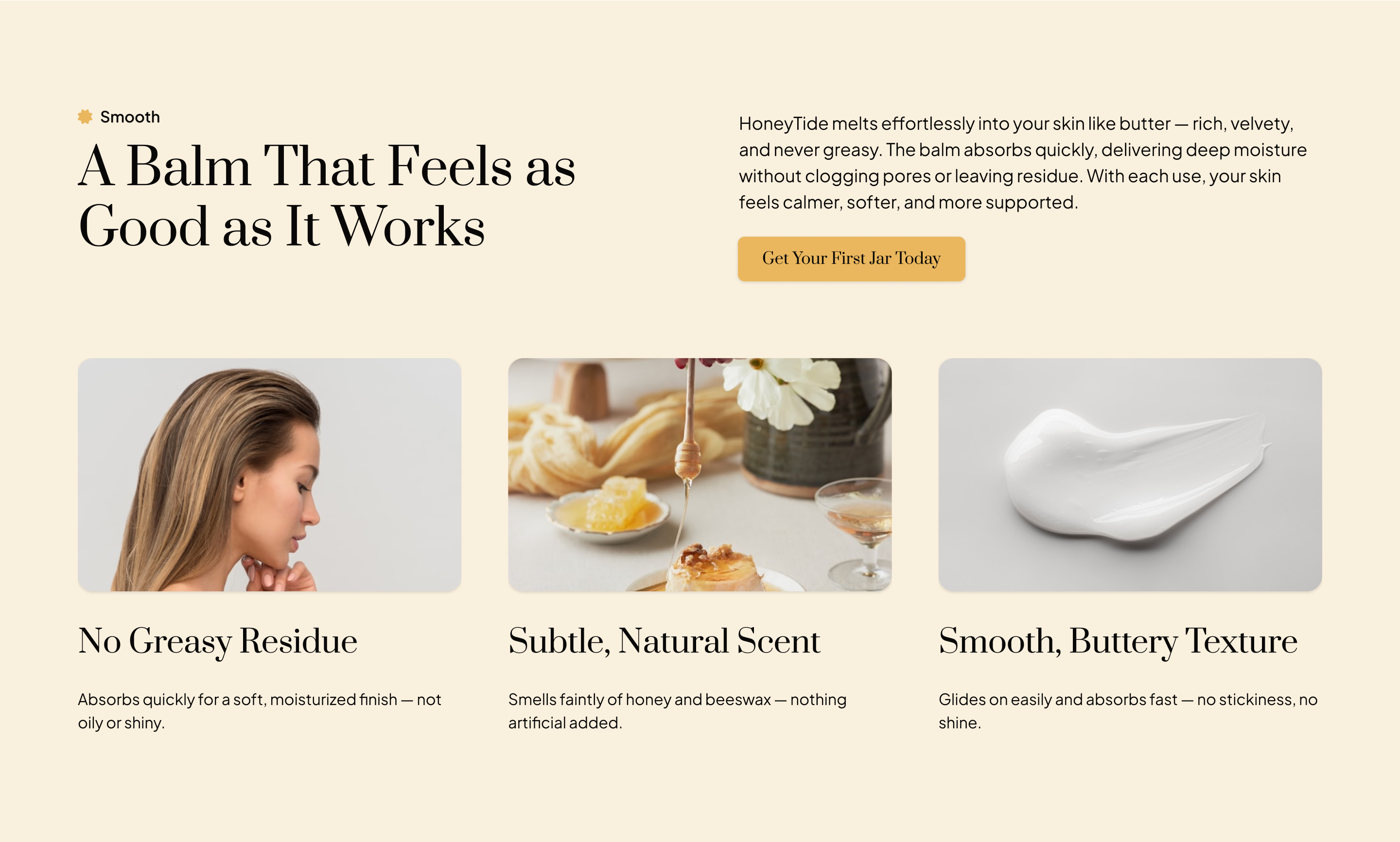
The goal here is to make someone imagine the texture and finish before they even try it, so they know it won't leave a sticky uncomfortable residue on their skin, and feel like they know exactly what they’re getting.
Section 6: Real People Using the Product
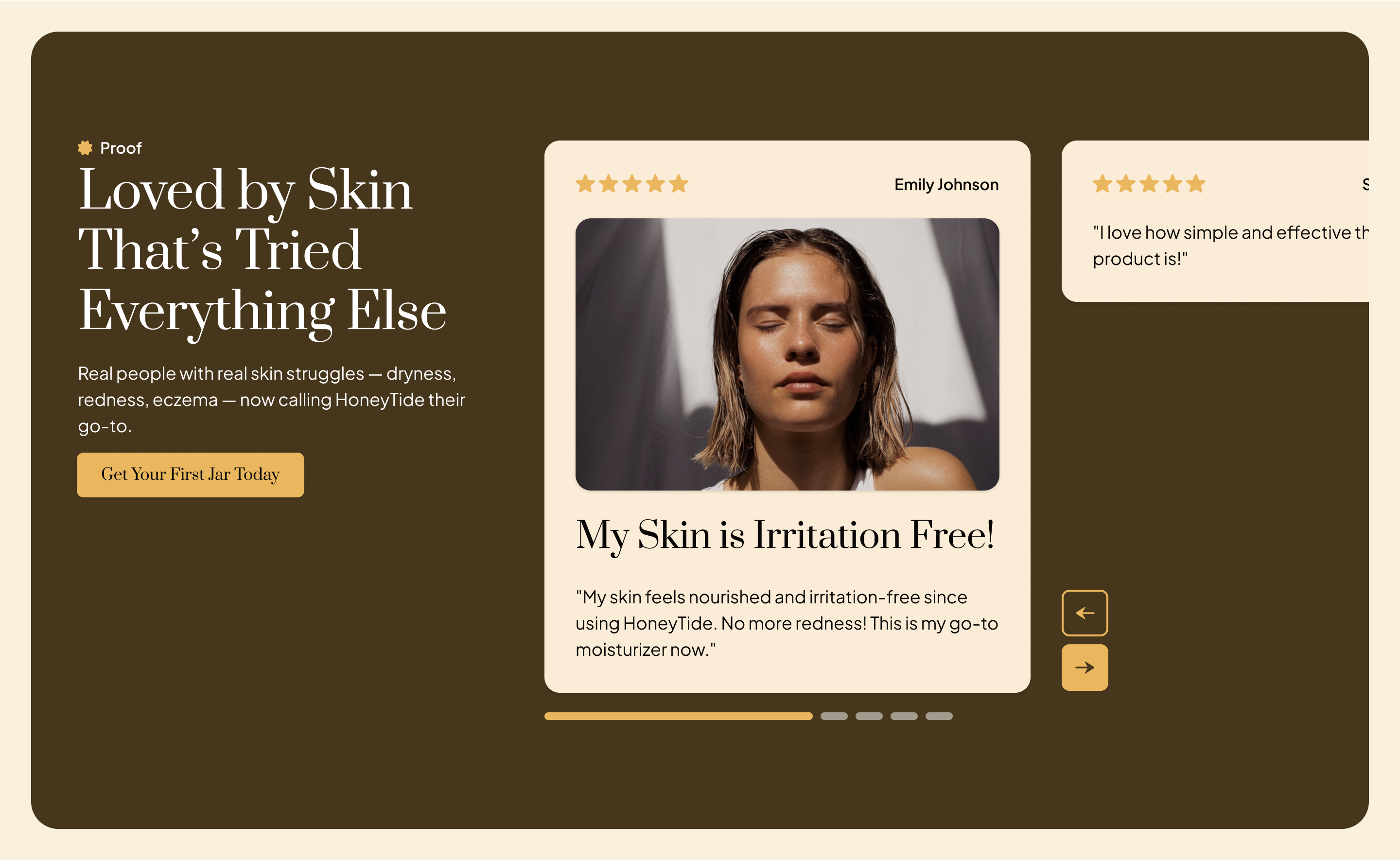
This section shows that the product works for real people. By using real names, and short quotes of skin issues, it reassures new buyers that this balm is proven to work
Section 7: What they Get & its Value
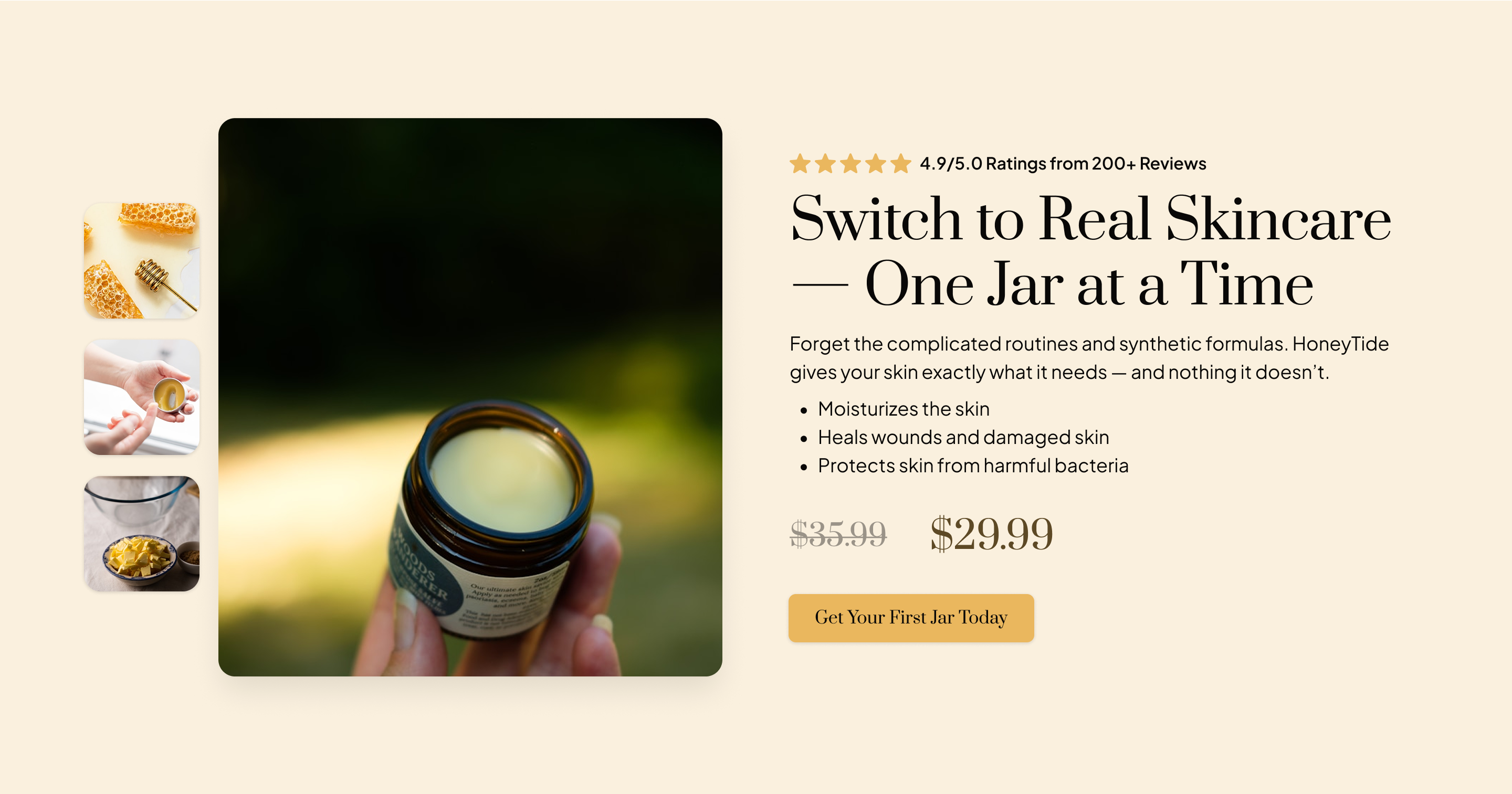
This is where the value is stacked. The product, the reviews, the price all laid out clearly. The section reduces hesitation by showing exactly what’s included and why it’s a good deal.
Section 8: Clear Up the Last Doubts
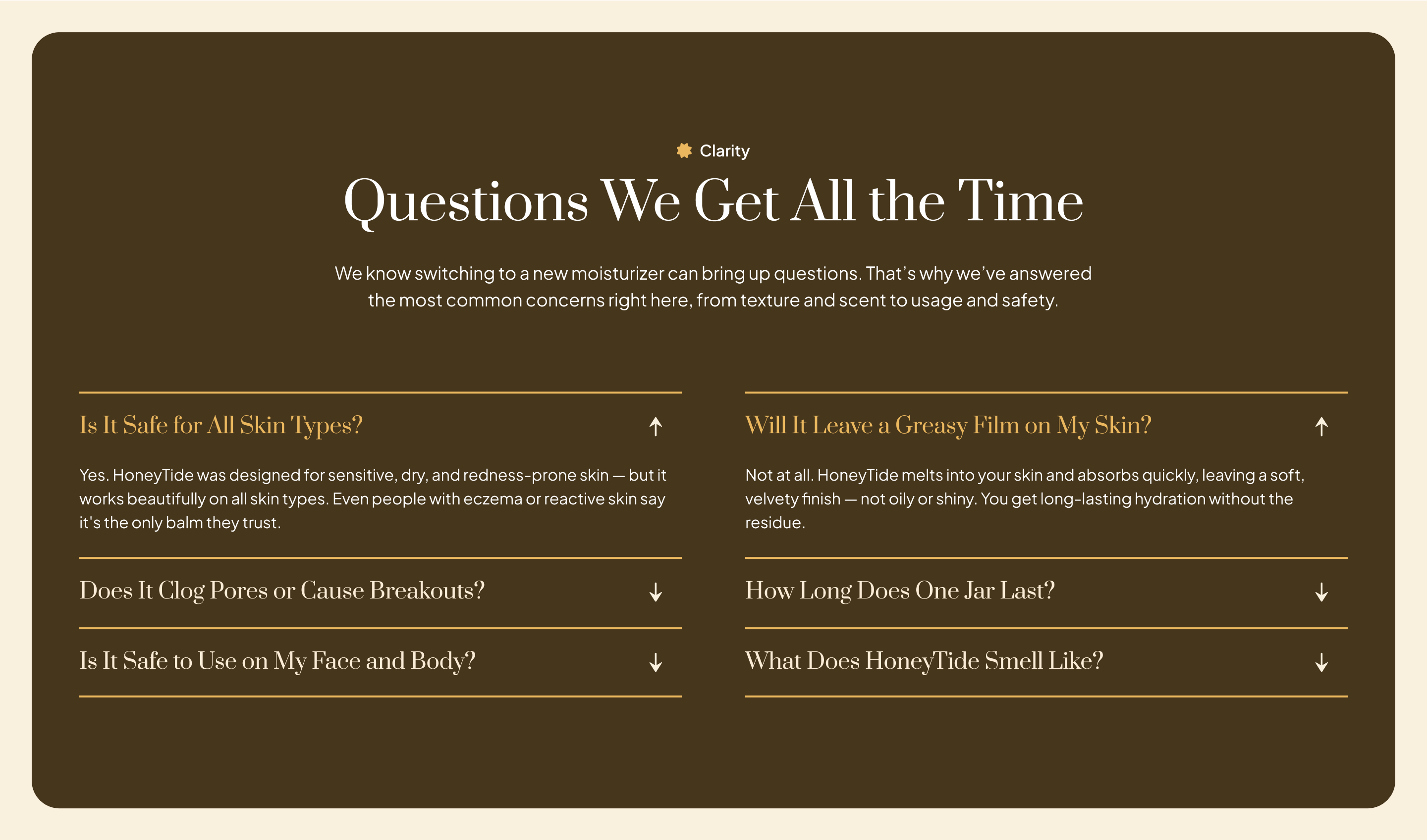
This section answers questions people ask before buying. It helps remove the last bit of hesitation so they feel safe clicking the button.
Section 9: One Last Push to Buy
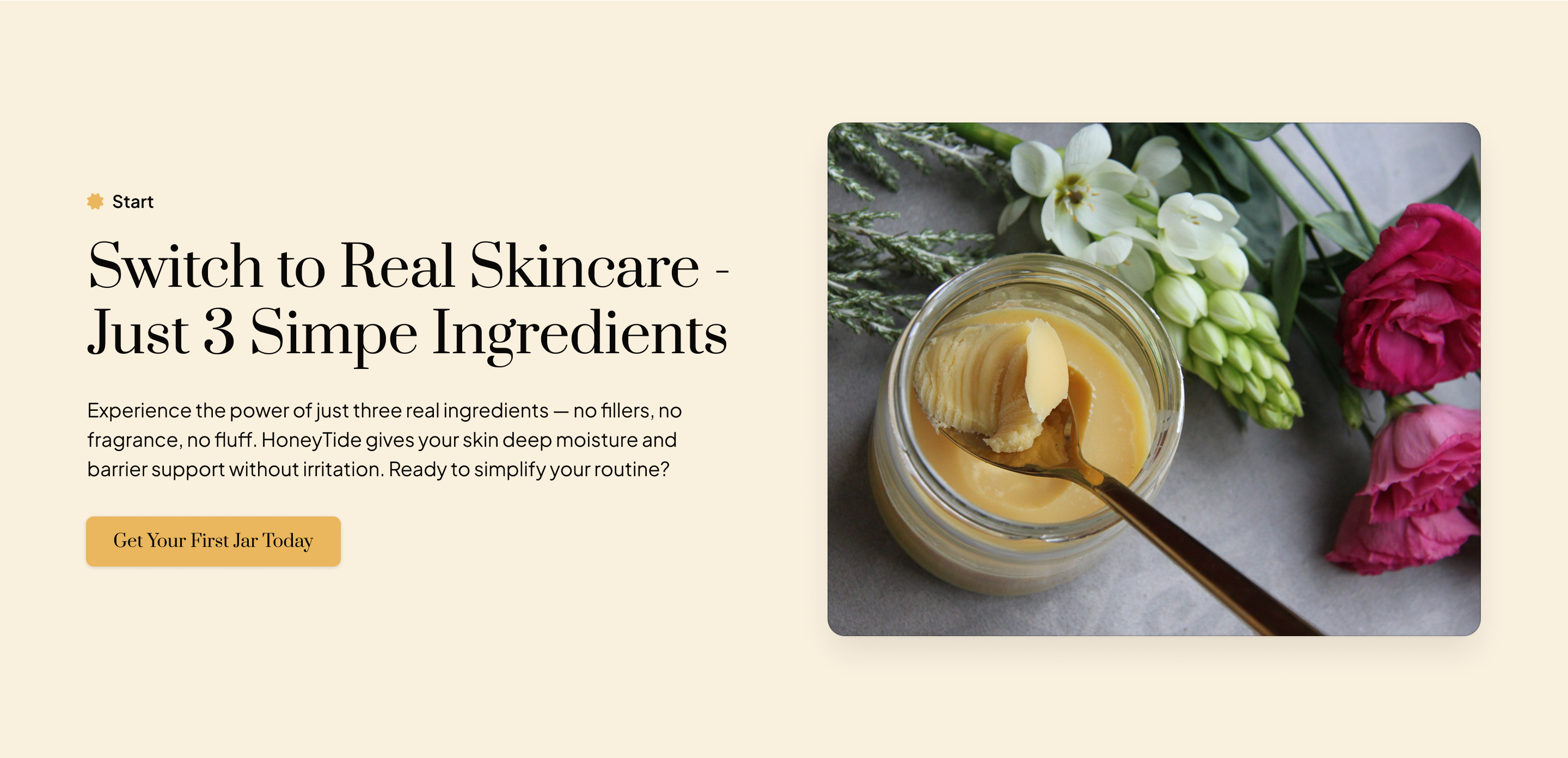
The last section gives one more chance to buy, but this time, it feels easier. They’ve seen the product, read the proof, and now it’s just one click away.
How It All Works Together:
The page follows a proven persuasion framework:
- Hook the visitor fast
- Connect with their problem
- Introduce them the solution
- Show the ingredients
- Assure the texture quality
- Prove it works
- Stack the value
- Remove doubts
- Push them to buy it
Each section works with the next. By the time someone sees the CTA again, they have seen proof, value, and trust signals that make saying yes feel like the only option.
Expected Results:
This landing page was built to outperform the average skincare page.
By focusing on a single offer, explaining why it is different, and answering objections early, the design is set up to create higher conversions, lower cost per customer, and more confident first-time buyers.
Here is what we would expect in the real world:
- Conversion Lift: 20–40% higher than typical natural skincare pages that have no clear offer or story.
- Time-to-Conversion: Faster buying decisions thanks to a simple flow and clear product promise.
- Higher AOV: More bundled orders because of the value-added bonuses in the offer.
What Makes This Page Work:
Most skincare pages only show off the product. This one is designed to take someone from “what is this” to “I need this.”
It works because:
- It builds trust first. The problem section makes people feel understood before asking for the sale.
- It is clear and linear. Every section answers a natural buyer question: What is it? Why is it better? What is in it? Will it work for me?
- It sells the offer, not just the jar. The page stacks product benefits with bonuses, a guarantee, and emotional reasons to act.
- It removes risk. The guarantee, social proof, and low-pressure CTA make it easy to say yes.