.png)
.png)
Mind Matcha 🍵 | Matcha Landing Page
Mind Matcha is a clean, functional matcha powder designed for high-performers and wellness-conscious buyers. The brand needed a page that would not only showcase the benefits of switching from coffee — but actually drive conversions with first-time buyers who are skeptical, busy, and overwhelmed by wellness products.
The Problem:
The biggest challenge? Most matcha brands talk about “energy”, but the buyer already has energy (from coffee). What they’re actually craving is calm, sustainable focus. That shift in positioning required a landing page built around a clearer story, stronger offer, and easier buying experience.
The Solution:
Every section was structured to reduce friction, answer objections, and lead the buyer toward a single, clear action: trying Mind Matcha.
From the messaging to the layout, the entire page is engineered around one core principle:
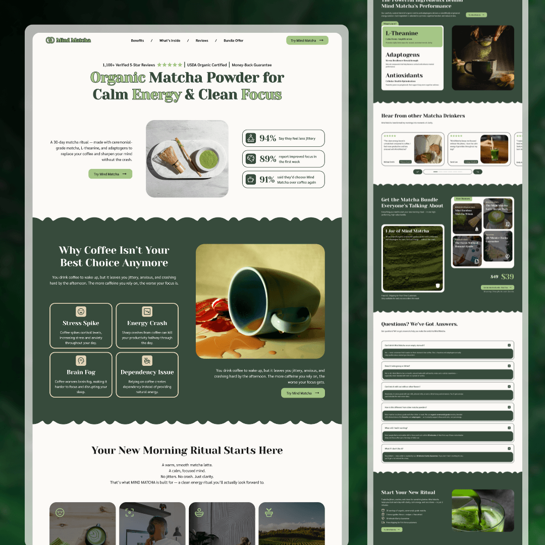
Section 1: Above the Fold - Strong First Impression
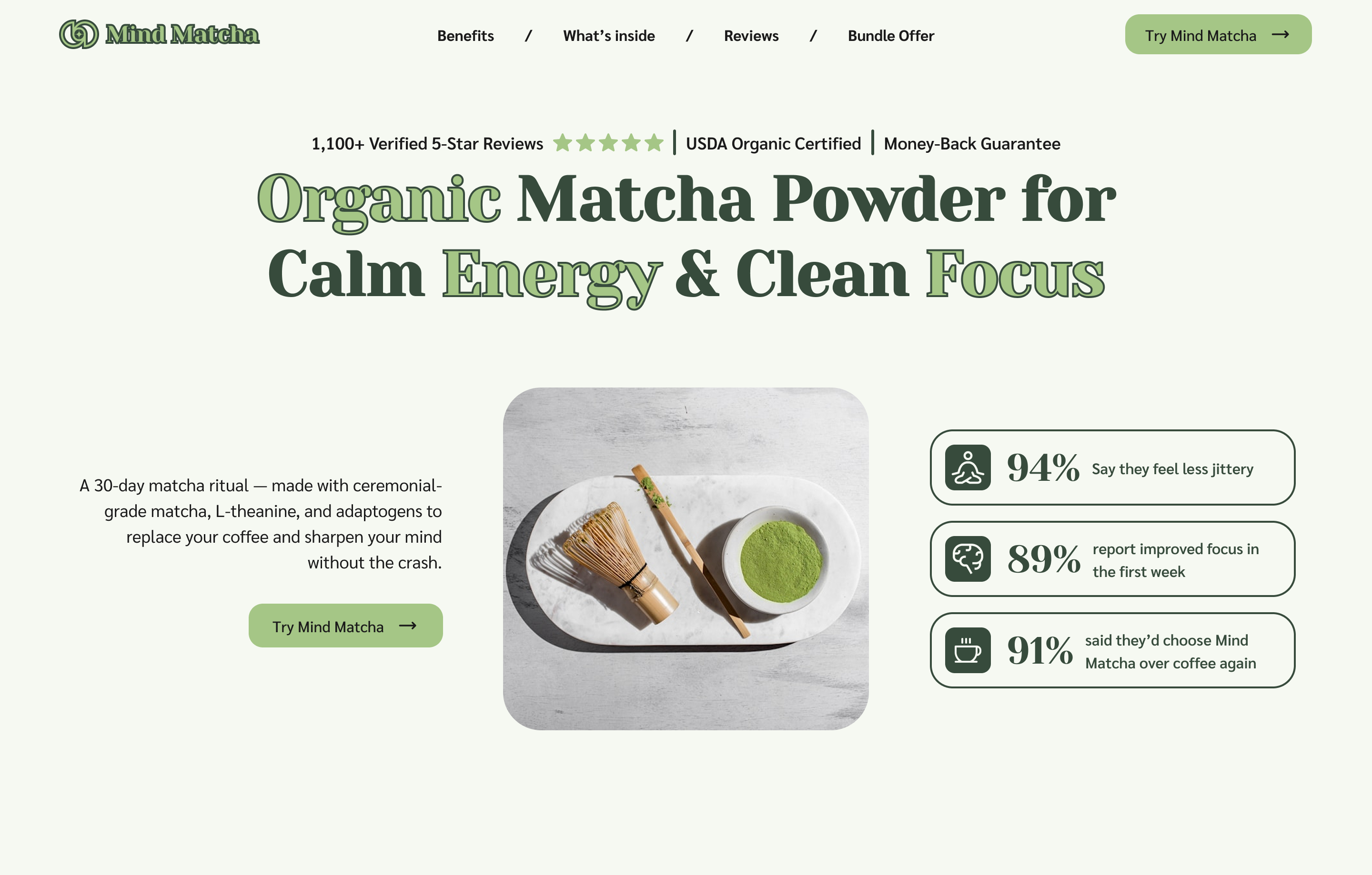
This hero section tells you exactly what the product is, what it helps with, and why you should care, all in the first 5 seconds.
It uses trust badges, reviews, and a bold headline to grab attention and drive clicks.
Section 2: The Problem - Shows Customers They’re Understood
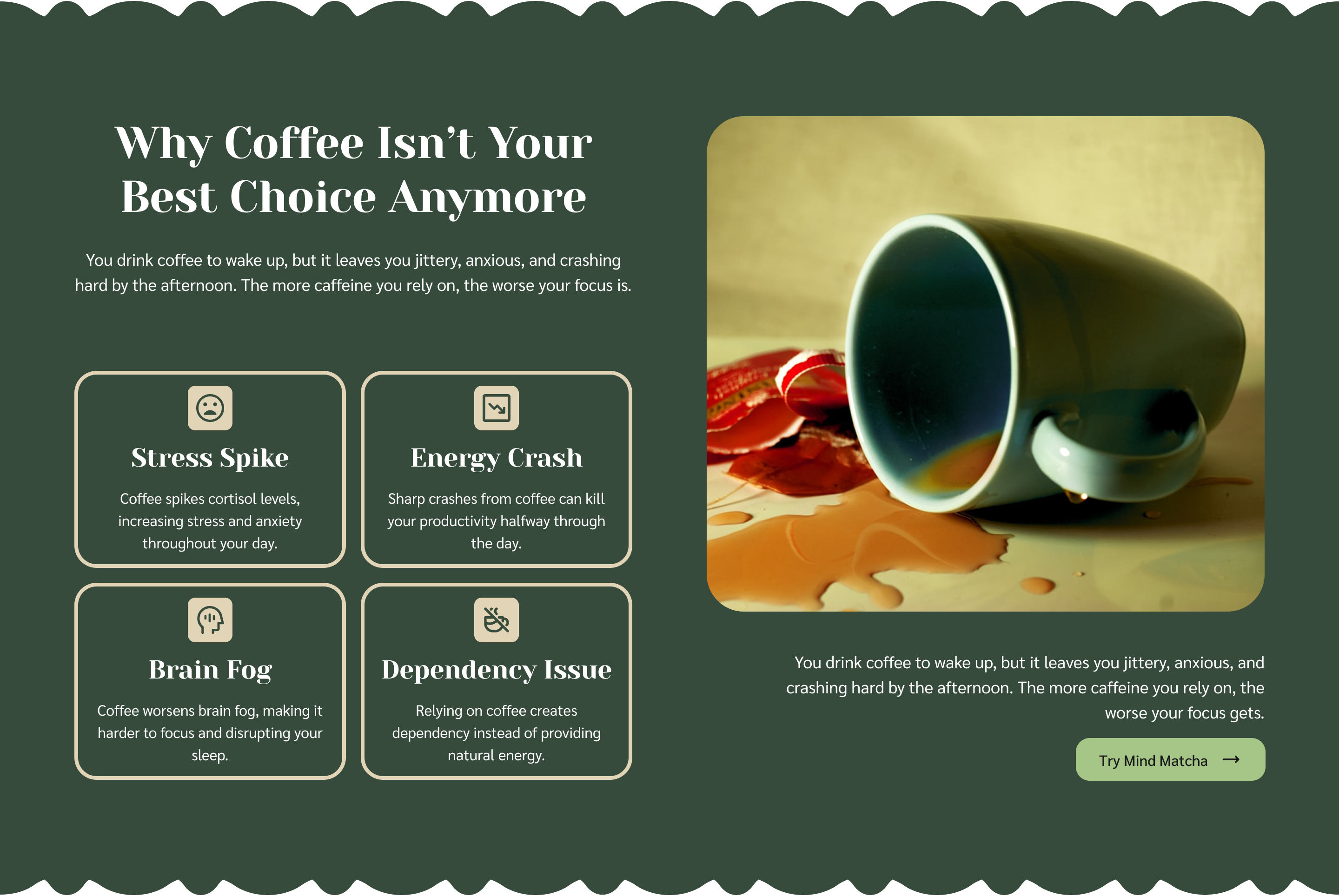
This section is designed to make the visitor feel seen.
Instead of rushing into product features, it focuses on shared frustrations, like energy crashes, jitters, and stress, that wellness buyers already deal with.
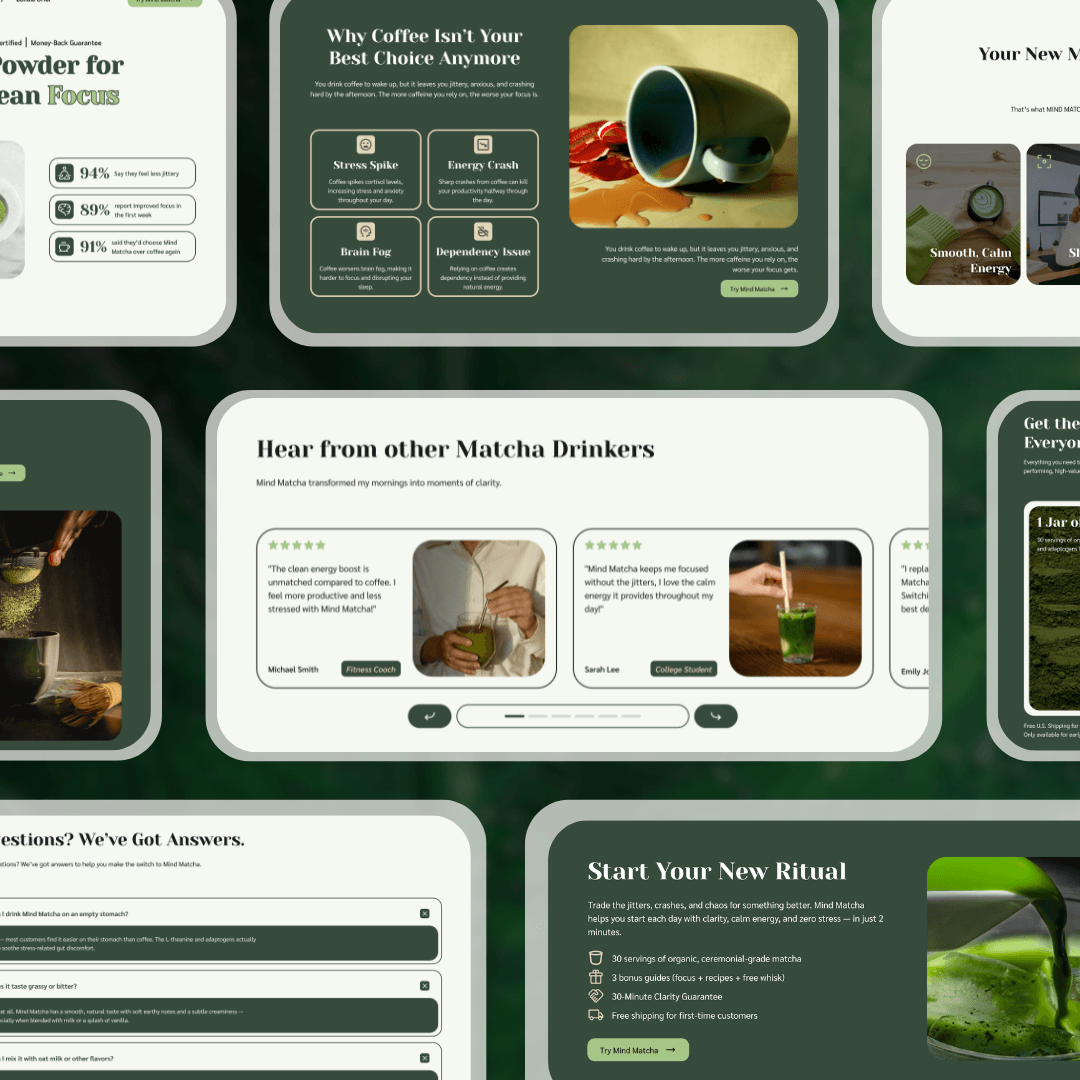
Section 3: The Solution - Present a Better Alternative
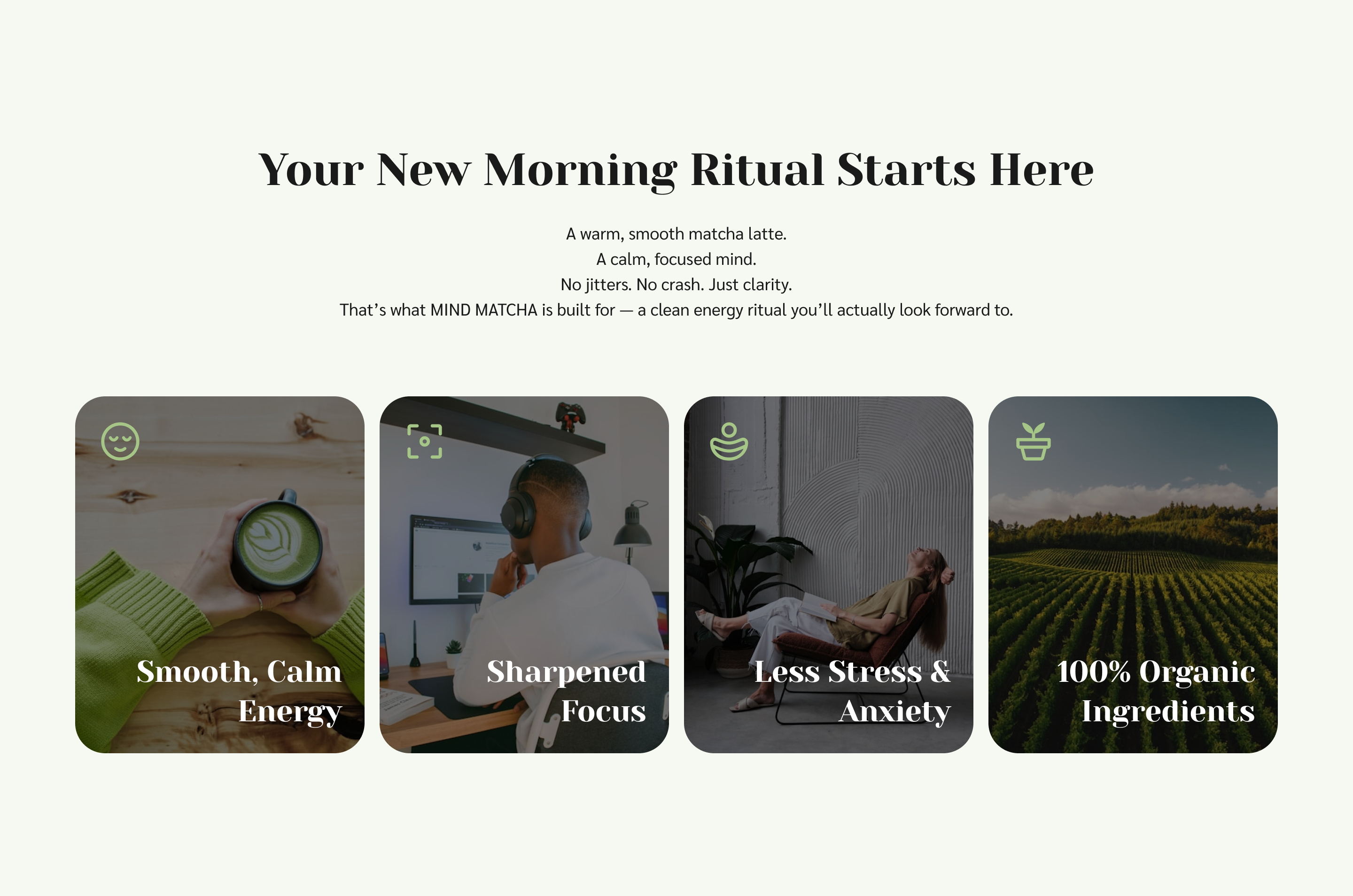
Now that they feel seen, your offer your product as the smarter, cleaner upgrade.
It makes the switch feel easy and desirable by positioning Mind Matcha as a calming daily ritual, not just another supplement.
Section 4: Ingredients - Back the Product With Proof
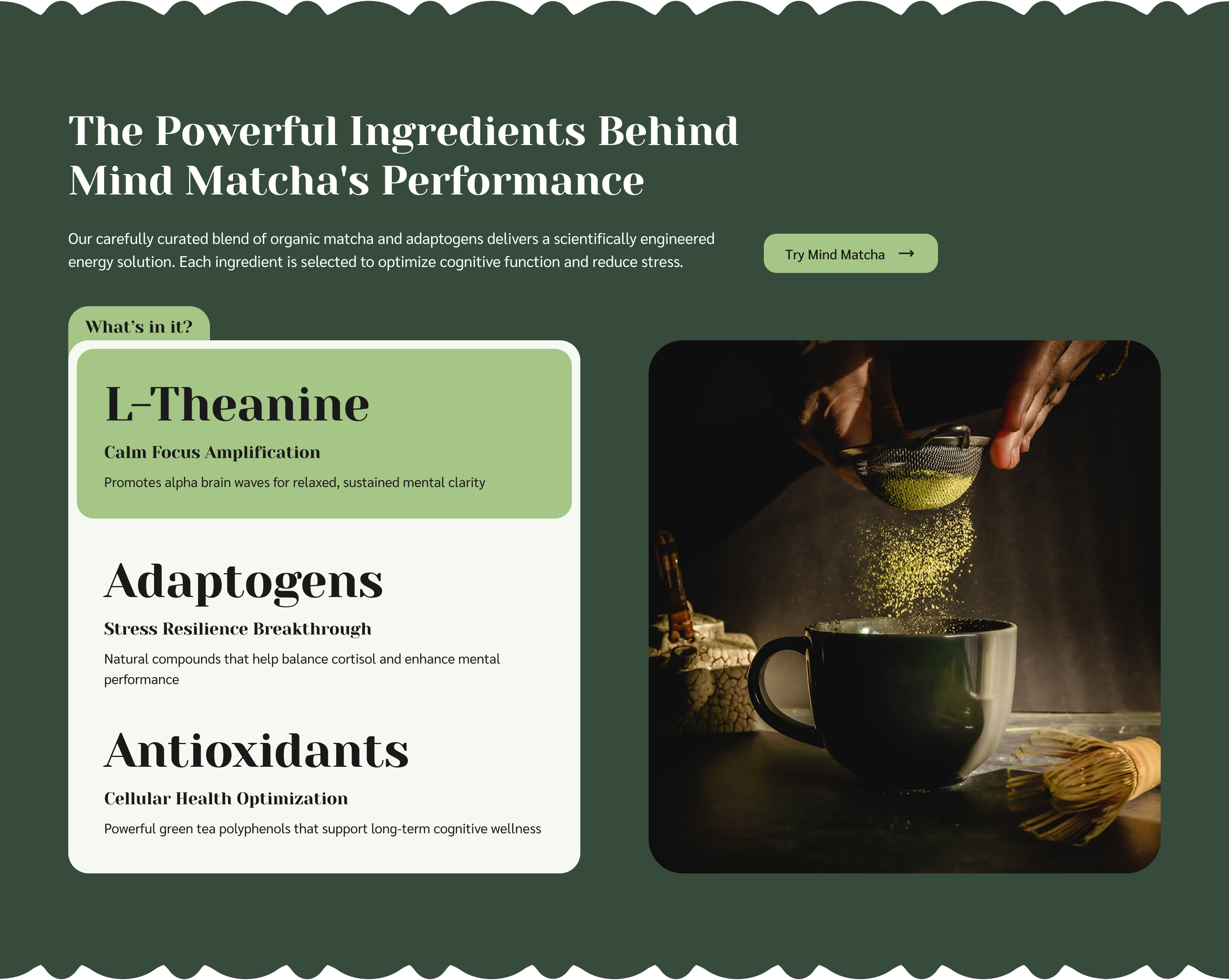
This section gives your product credibility. By highlighting each ingredient with its specific benefit, it reinforces why the product works and makes health-conscious customers feel more confident about what they’re putting in their body.
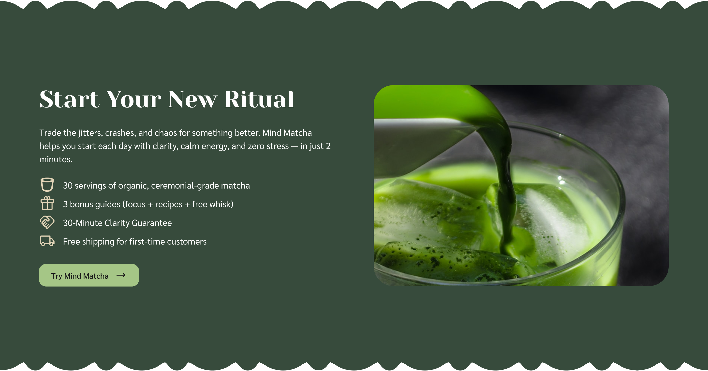
Section 5: Offer Section - Stack the Value
.png)
This is where the real offer comes in. It doesn't just show the jar of matcha, it sells the bundle. This section uses bonuses, pricing contrast, and a risk-free guarantee to boost perceived value and push the reader toward action.
Section 6: Reviews Section - Use Social Proof
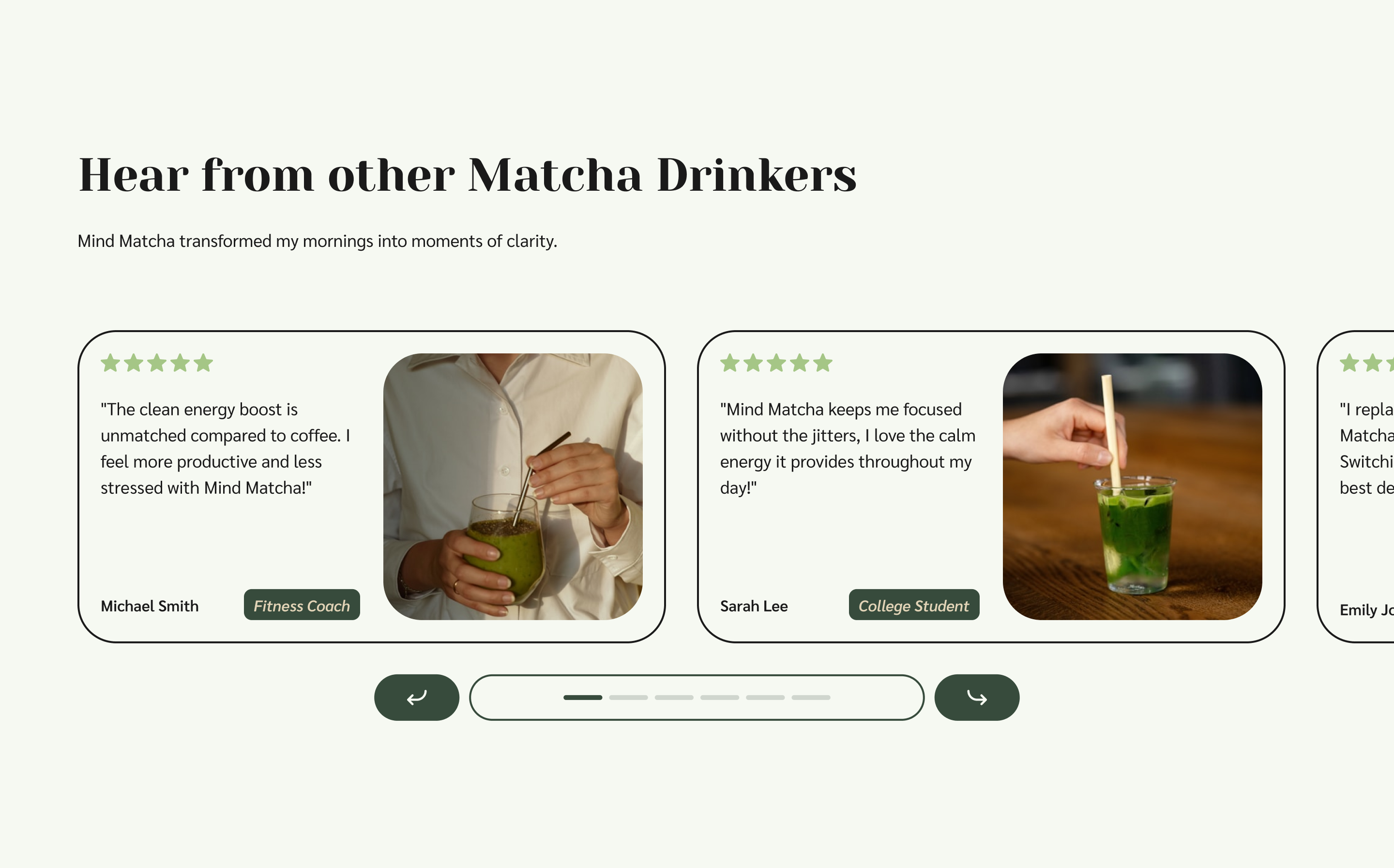
This section uses real faces and quotes to show that Mind Matcha works in real life.
It’s not just about 5-star ratings, it creates relatable use cases that help visitors imagine themselves getting similar results.
Section 7: FAQ Section - Remove Final Doubts
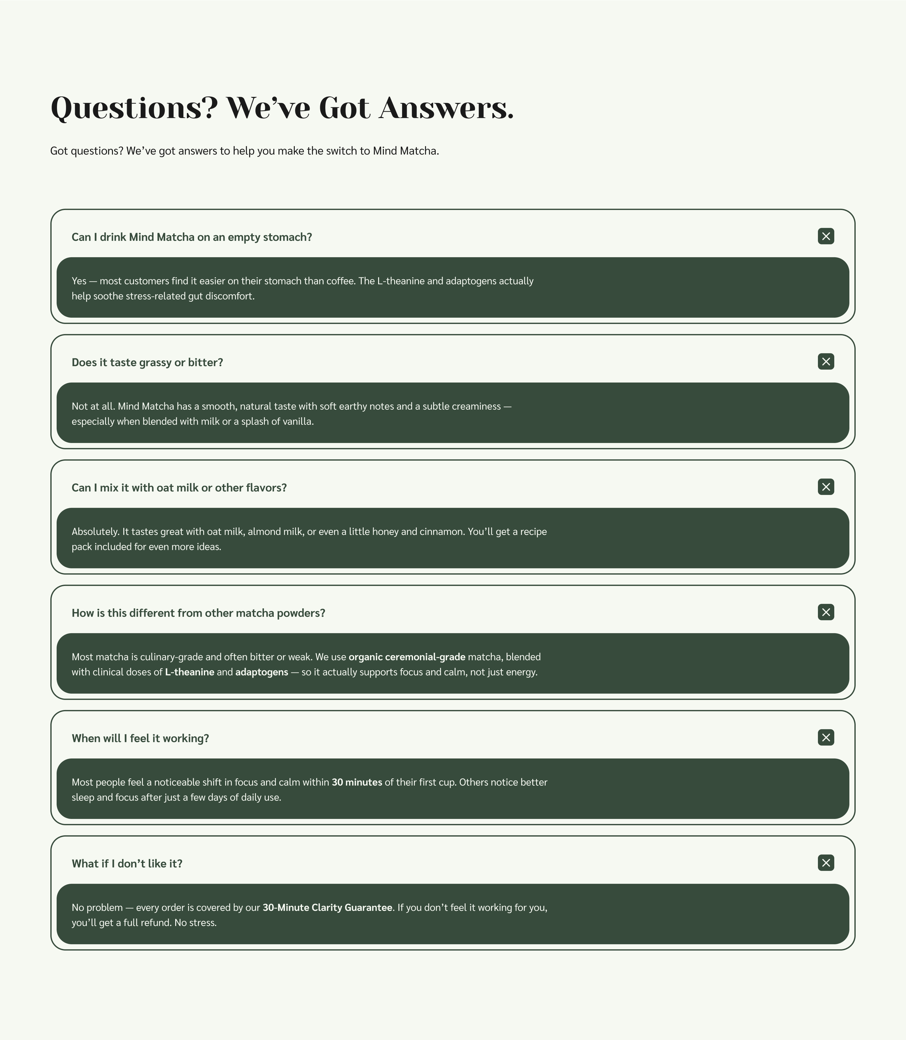
This is the last defense against hesitation.
By proactively answering objections (taste, digestion, effectiveness), it smooths the path to purchase and makes the decision feel safe and low-pressure.
Section 8: Final CTA - Encourage the Click
This section wraps everything into one clear offer, price, product, bonuses, and guarantee, all in one glance.
It uses a single, low-pressure button to convert into buyers.
How It All Flows Together:
The structure follows a time-tested persuasion framework:
- Hook the visitor fast
- Resonate with their problem
- Align with their values
- Reveal a compelling solution
- Stack the offer with value
- Prove it works
- Ease their objections
Each section isn’t standalone, it’s a conversion domino. By the time they hit the CTA again, they’ve seen proof, relevance, value, and ease, making action the only logical next step.
Expected Results:
This landing page wasn’t built to be a placeholder, it was built to beat what most wellness brands settle for.
By focusing the entire page around a single offer, addressing objections early, and reinforcing clarity at every scroll depth, this design is structured to drive higher conversions, lower cost-per-click waste, and more confident first-time buyers.
Here’s what we’d expect from a page like this in the real world:
- Conversion Lift: +20–40% higher than standard DTC wellness product pages with scattered messaging and no clear offer.
- Time-to-Conversion: Faster buyer decisions due to a frictionless page flow and clear product promise.
- Cart Quality: More bundled checkouts (due to bonus stacking), leading to increased average order value (AOV).
- Ad Performance Boost: Better post-click experience = stronger ad efficiency + higher return on ad spend (ROAS).
In short, this isn’t just a nice-looking page, it’s a page with purpose. It speaks the buyer’s language, answers their concerns, and gives them a clear reason to take action now.
What Makes This Page Work
Most product pages are built to show off the product. This one is built to move someone from “what is this?” to “I want this.”
It works because it’s not just pretty, it’s structured around how real people make decisions:
- It builds emotional trust before asking for anything.
The problem section makes visitors feel seen. It doesn’t push the product, it earns the right to talk about it. - It tells a clear, linear story.
Every section exists to answer the next natural question in a buyer’s mind. What is it? Why is it better? What’s in it? Will it work for me? - It sells the offer, not just the product.
Instead of listing features, it stacks value: product + bonuses + guarantee + emotional benefit. That’s what moves people to act. - It removes risk, not just adds hype.
The guarantee, social proof, and low-pressure CTA combine to make the purchase feel safe, simple, and logical.
This is what conversion design actually looks like. It’s not just about making a page look good. It’s about making the page do its job.